Tony's Chocolonely
Tony's Chocolonely
CREATIVE DIRECTION
CREATIVE DIRECTION
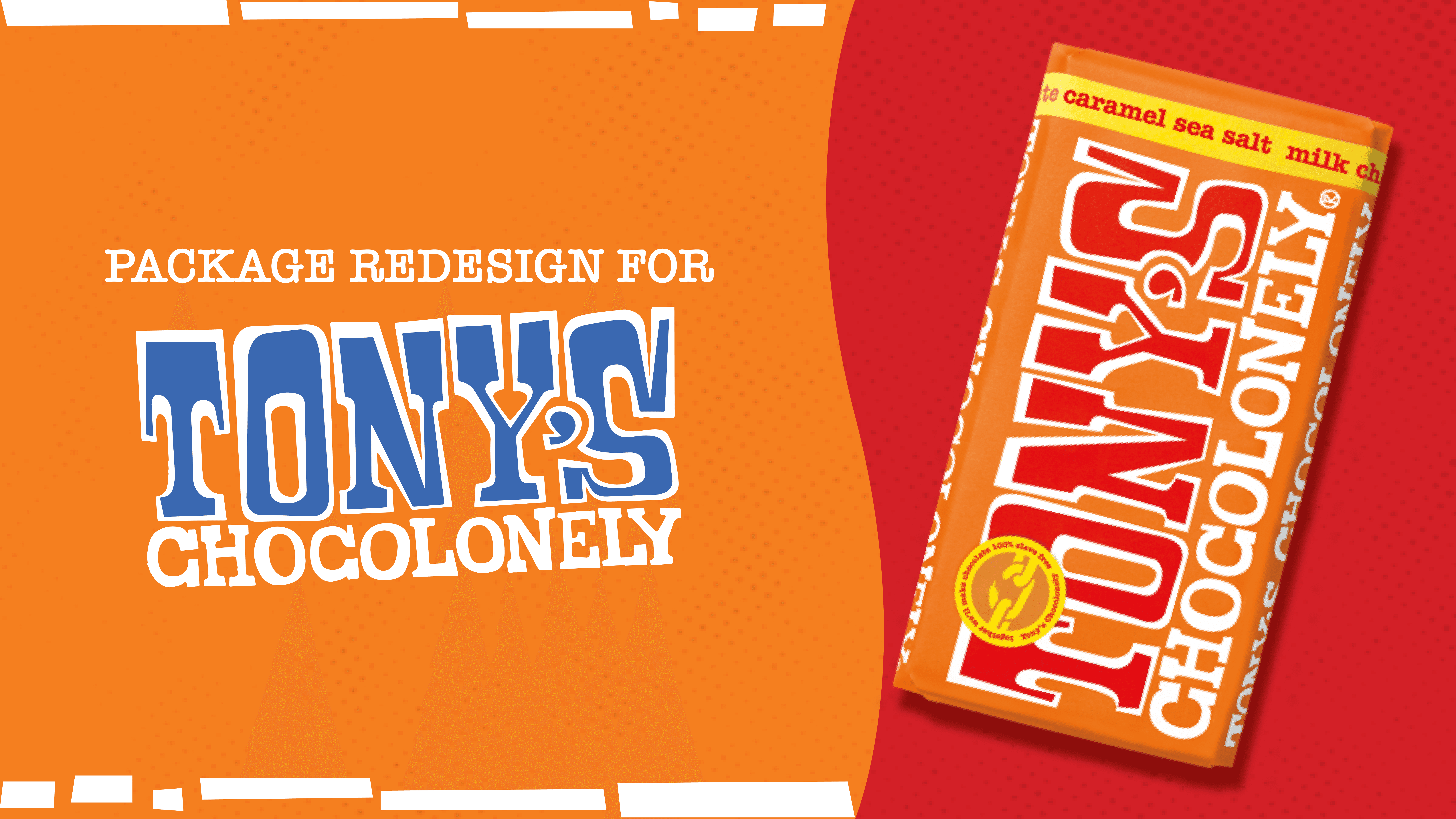
PACKAGE REDESIGN
PACKAGE REDESIGN
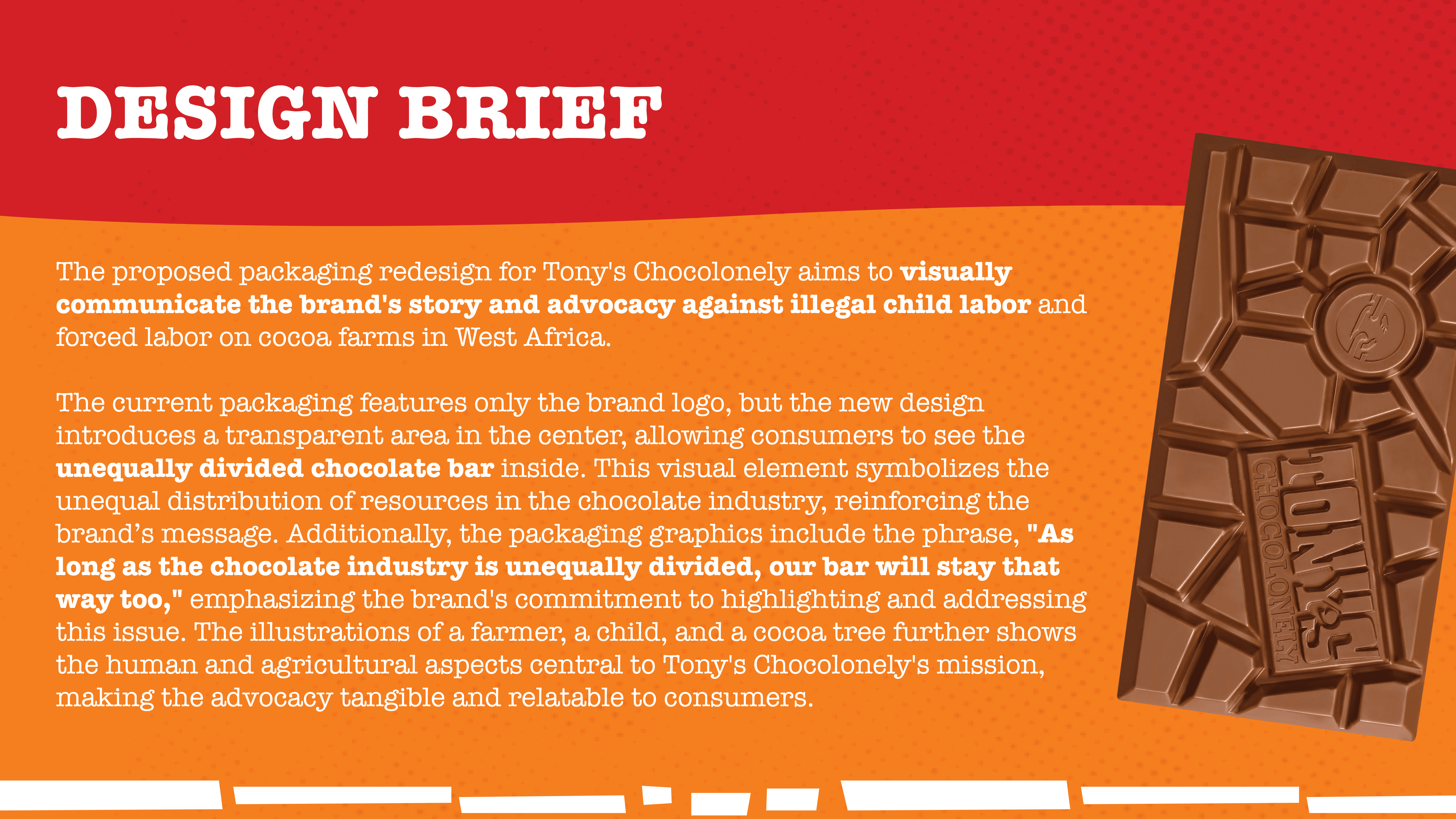
Brief
Insight
Consumers are more likely to engage with brands that transparently communicate their values, especially when the design directly reflects the social issues they aim to solve.
Tony's Chocolonely’s current packaging does not fully communicate the brand's commitment to fighting inequality and exploitation in the cocoa industry, making it harder for consumers to understand the brand's mission at a glance.
Idea
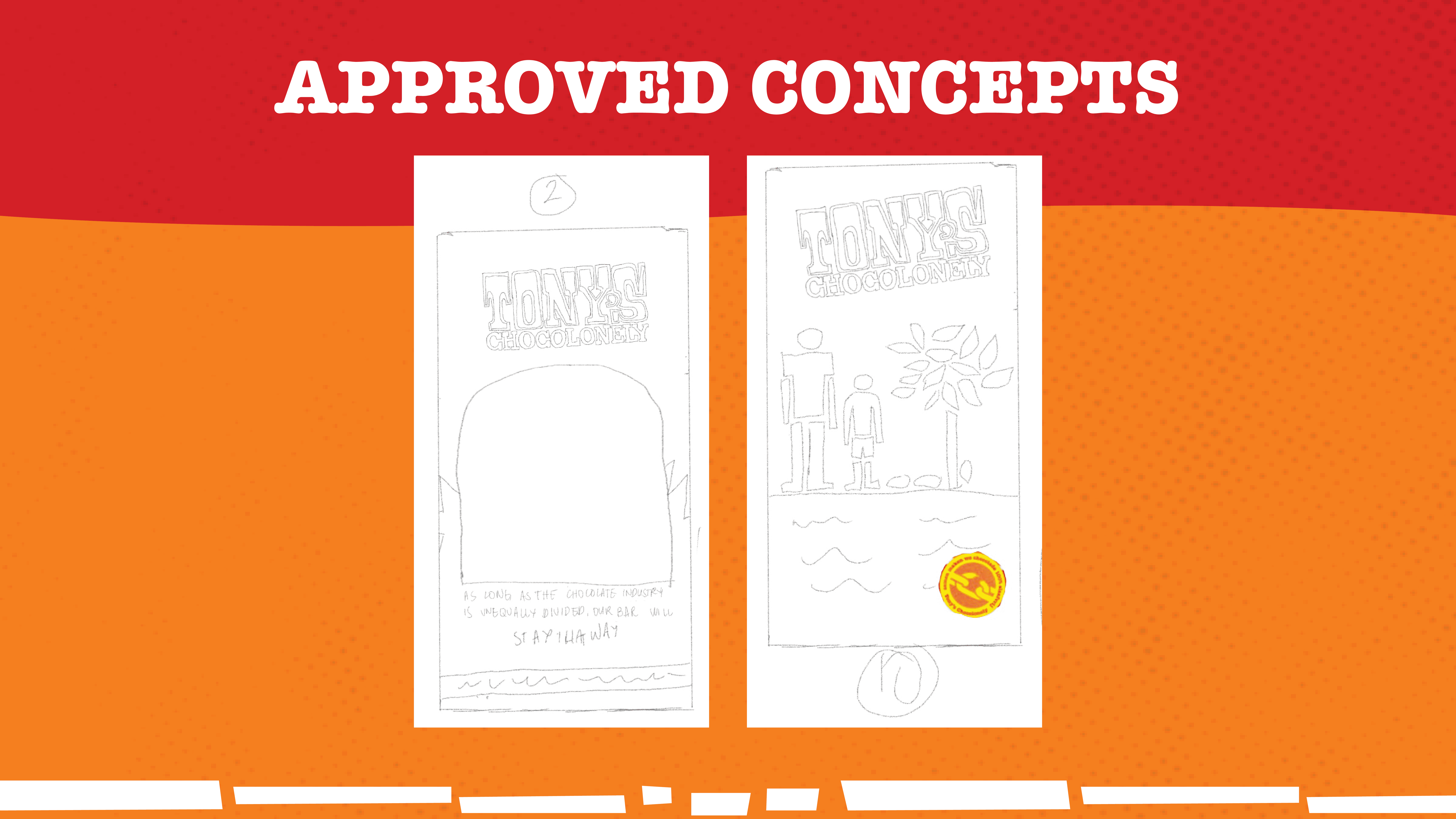
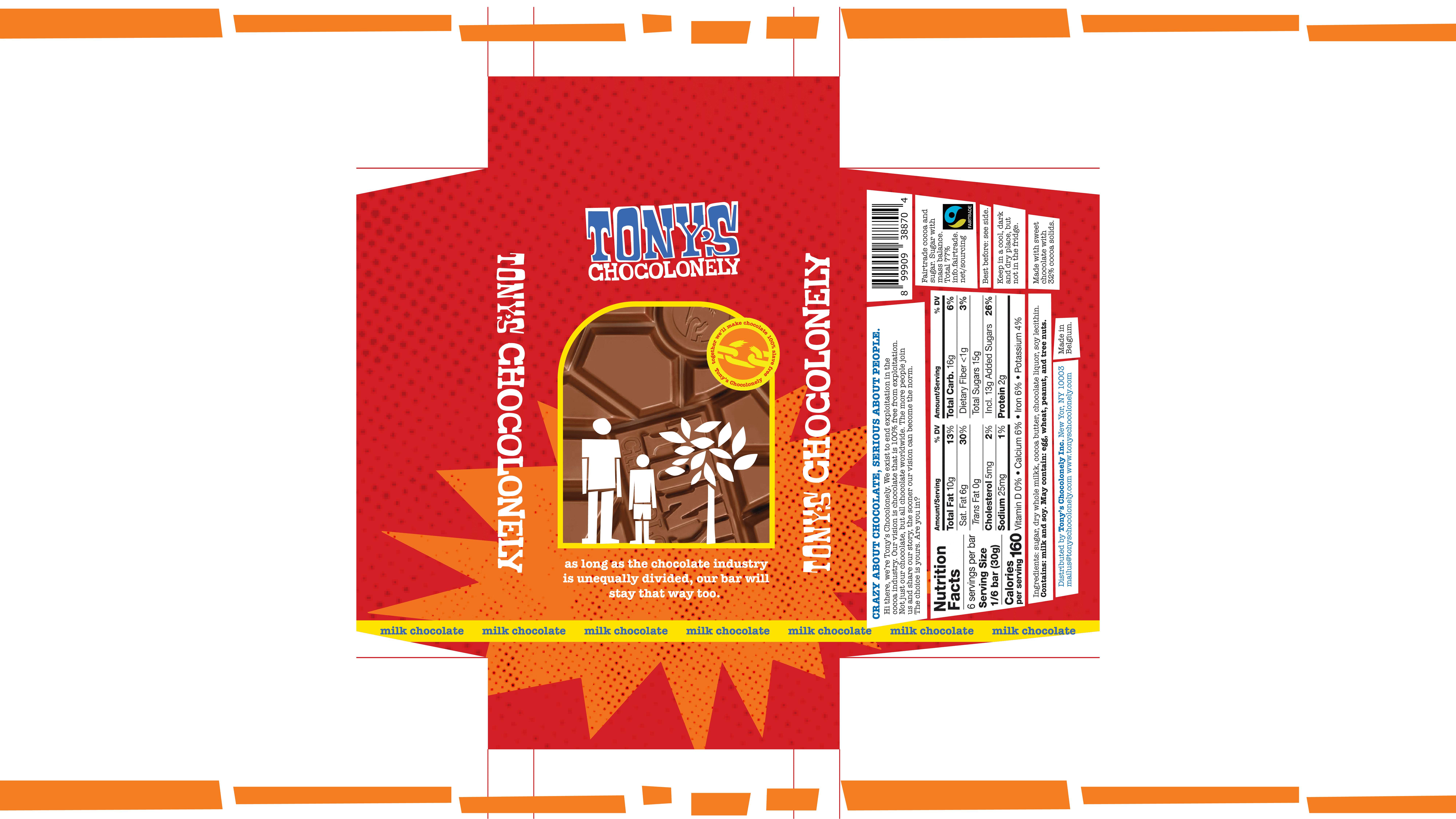
A redesigned packaging with a transparent section in the center, allowing consumers to see the unequally divided chocolate bar inside.
This visual, paired with the message “As long as the chocolate industry is unequally divided, our bar will stay that way too,” reinforces Tony's Chocolonely's advocacy against unfair labor practices.
The design also features illustrations of a farmer, a child, and a cocoa tree, highlighting the people and resources behind each bar, making the brand’s mission visible and memorable for consumers.
The Grow for Earth brand identity combines a warm, earthy color palette, approachable typography, and a clever logo where a hand forms the “G” and a plant leaf forms the “e,” symbolizing growth and commitment to the planet.
This modern, organic aesthetic resonates with environmentally conscious youth, making sustainability feel approachable and actionable.
Through geometric patterns and a contemporary design, the brand inspires young people to engage in hands-on climate action, starting with a tree-planting program in Laguna, Philippines.
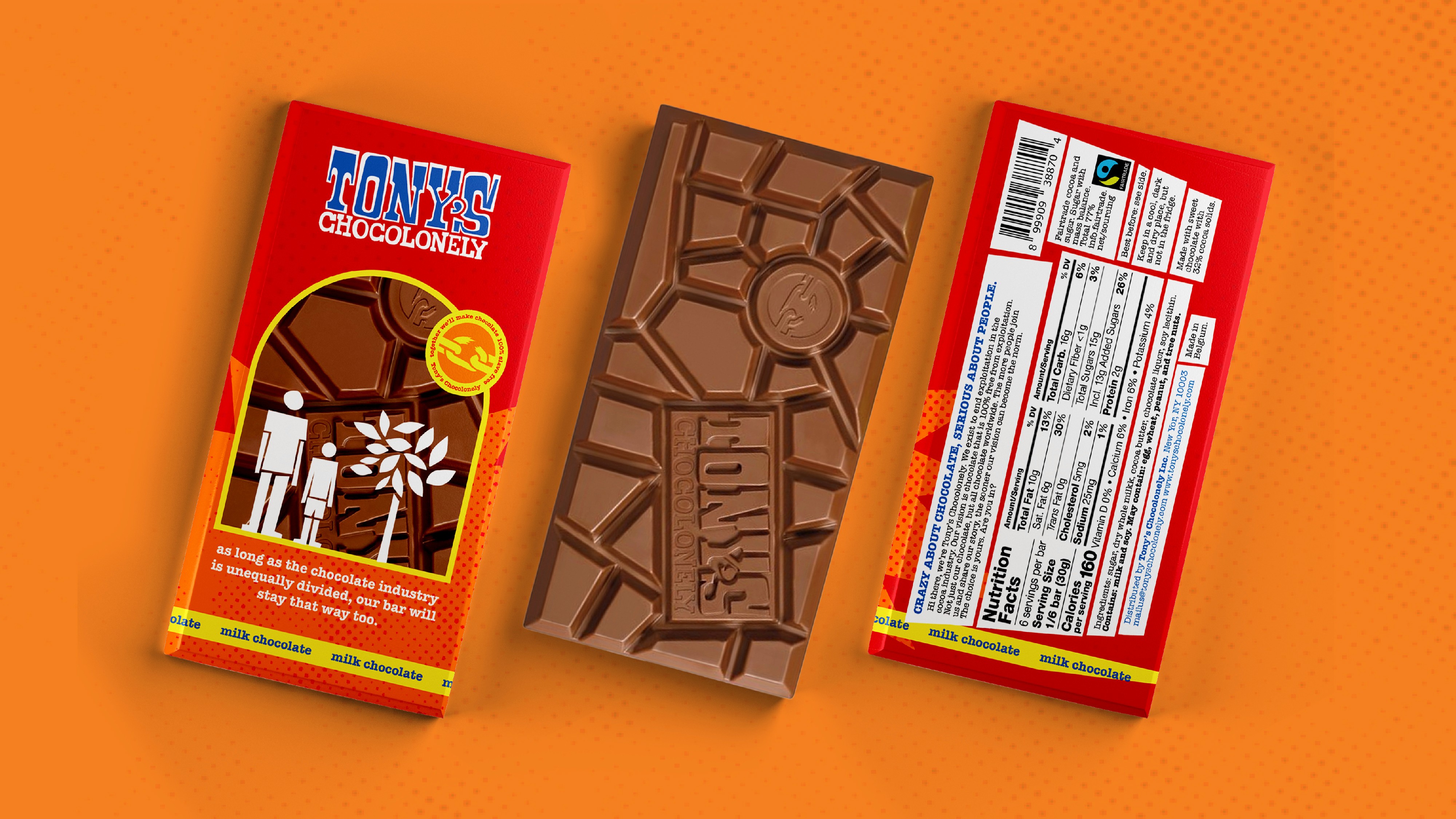
A redesigned packaging with a transparent section in the center, allowing consumers to see the unequally divided chocolate bar inside.
This visual, paired with the message “As long as the chocolate industry is unequally divided, our bar will stay that way too,” reinforces Tony's Chocolonely's advocacy against unfair labor practices.
The design also features illustrations of a farmer, a child, and a cocoa tree, highlighting the people and resources behind each bar, making the brand’s mission visible and memorable for consumers.
Create a brand identity that engages and empowers youth to address climate change through hands-on, community-driven action, beginning with a tree-planting program in Laguna, Philippines.